October's Very Own Festival Poster & Tickets
.jpg)
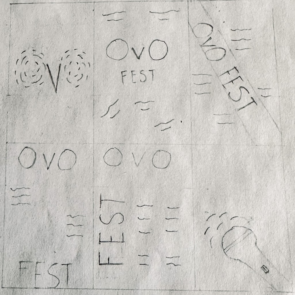
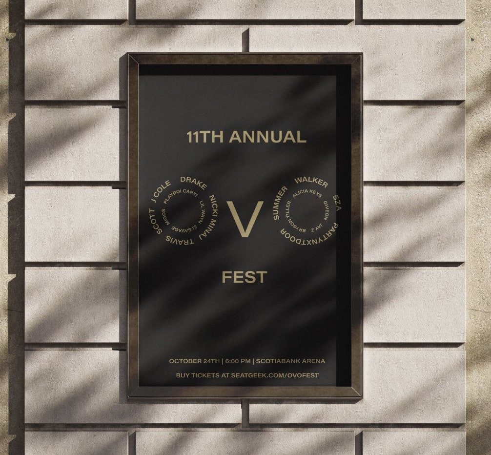
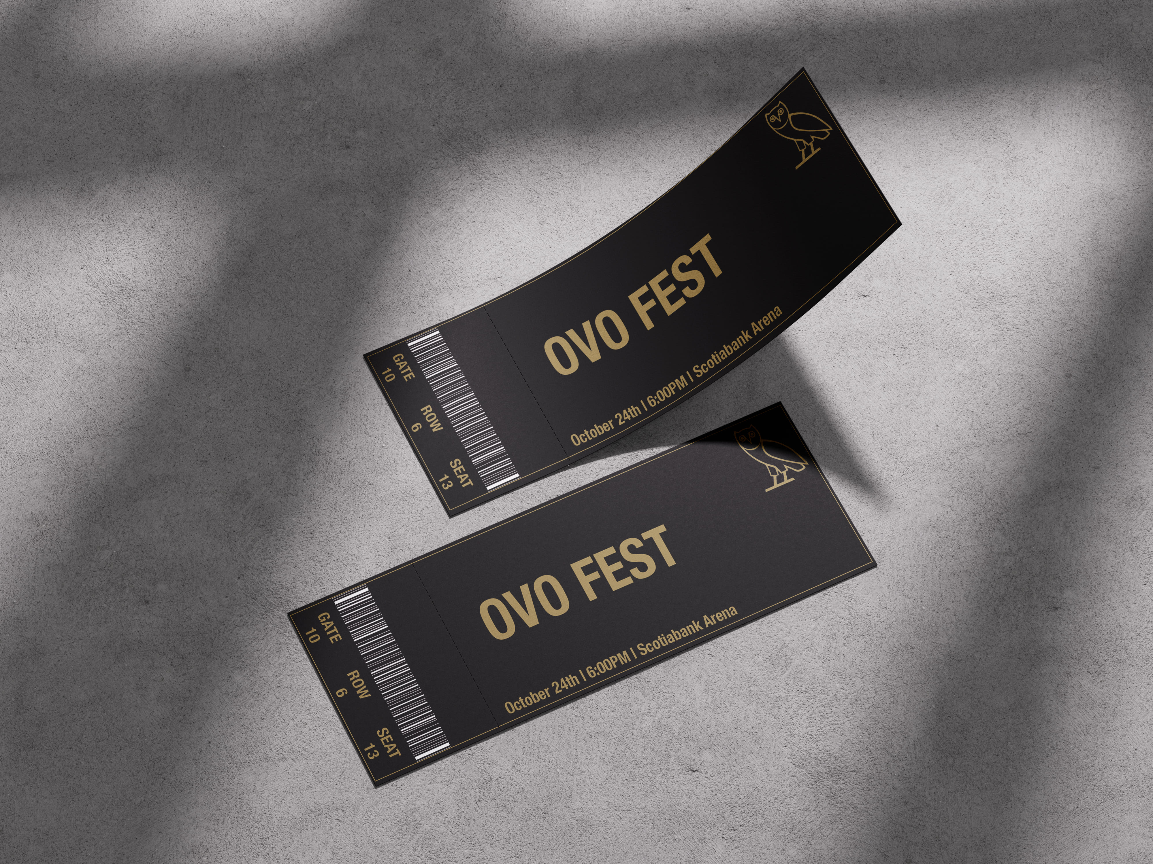
This poster is a conceptual festival poster design using a typographic system. The goal here was to experiment making a poster using systems like axial, directional, spiral etc. I ended up going with the OVO brand because I thought a spiral system would work perfectly with the letters already being used in the name. This design uses hierarchy and good contrast which makes this poster legible. The client for this project was OVO Sound, a music label, and my role was designing the poster with full creative control over selecting the typographic system, layout, and colour.